

I have HTML structure like:
<div class="container">
  <div class="btn-1"></div>
  <div class="btn-2"></div>
  <div class="btn-3"></div>

  <div class="text">
  Lorem ipsum dolor sit amet, consectetur adipisicing elit. A veritatis harum illum assumenda odio ut, quos, ipsam molestias et sint nemo, saepe! Soluta a, quasi sequi, ut corrupti eius molestias.
  </div>
</div>
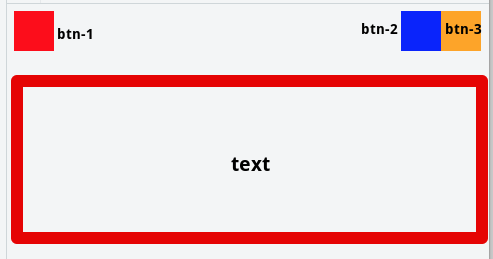
- btn-1 should be aligned to the top left, all other buttons (btn-2, btn-3...) should be aligned to the top right.
- The text after all these buttons should be 100% width.
Quick mockup:
I figured out the first part (buttons) with:
.container {
  display: flex;
  justify-content: flex-end;
}
.btn-1 {
  /* align first button to the left */
  margin-right: auto;
}
Bu not matter what I do, the text doesn't flow to the next line...
Here's my JSFiddle https://jsfiddle.net/an0o7taq/
Thanks for any help!
See Question&Answers more detail:os
