Welcome to ShenZhenJia Knowledge Sharing Community for programmer and developer-Open, Learning and Share
menu search
person
Welcome To Ask or Share your Answers For Others

Categories

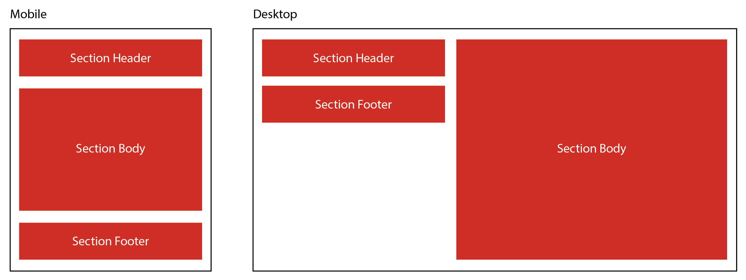
The easiest way to understand what I want to achieve is in the attached image.

Essentially, I want to create a responsive layout comprising of 3 elements within a section - a header, a body, and a footer. On smaller screens (i.e. mobile) the 3 elements simply stack as you'd expect.

However, on larger desktop screens, I want the elements to split into 2 columns - the header and footer on the left, and the body on the right.

The problem is I'm actually not sure I can create this behaviour with CSS alone.

Image to illustrate the problem described above

The best I can achieve ends up with the footer element staying in line with the bottom of the body element, like the below image (I understand why, I just want to figure out a way around this.)

Image to illustrate the closest solution I have achieved

I've tried a few methods using floated elements, as well as flexbox solutions and playing with the ordering, but with no success. I even tried some grid stuff, although my knowledge of grid isn't great so I may have missed something.

I know that I could use JS to do something such as moving the header and footer within a single parent element, or back out again, depending upon screen size. But I'm hoping there's a CSS-only way to achieve this, as that doesn't seem very elegant.

Thanks in advance for any suggestions!


与恶龙缠斗过久,自身亦成为恶龙;凝视深渊过久,深渊将回以凝视…
thumb_up_alt 0 like thumb_down_alt 0 dislike
268 views
Welcome To Ask or Share your Answers For Others

1 Answer

Use css-gridwith the use of `grid-template-areas" to define the placement of a specific section as the example below. To allow the body section to extend further then the header and footer, you just need to use 3 rows.

body {
  display: grid;
  margin: 0;
  padding: 20px;
  grid-gap: 20px;
}

section {
  background-color: red;
  color: white;
  padding: 10px;
}

#header {
  grid-area: header;
}

#body {
  grid-area: body;
}

#footer {
  grid-area: footer;
}

@media only screen
  and (max-width: 480px) {
    body {
      grid-template-areas:
        "header"
        "body"
        "footer";
    }
}

@media only screen 
  and (min-width: 481px) {
    body {
      grid-template-areas:
        "header body"
        "footer body"
        ". body";
      grid-template-columns: 4fr 6fr;
    }
}

/* for styling purpose only */

#body {
  min-height: 70vh;
}
<section id=header>Header</section>
<section id=body>Body</section>
<section id=footer>Footer</section>

与恶龙缠斗过久,自身亦成为恶龙;凝视深渊过久,深渊将回以凝视…
thumb_up_alt 0 like thumb_down_alt 0 dislike
Welcome to ShenZhenJia Knowledge Sharing Community for programmer and developer-Open, Learning and Share
...